Bartolo
Bartolo was born from a simple question: what does Italian tradition look like when it leaves the white tablecloth behind and goes out into the street?
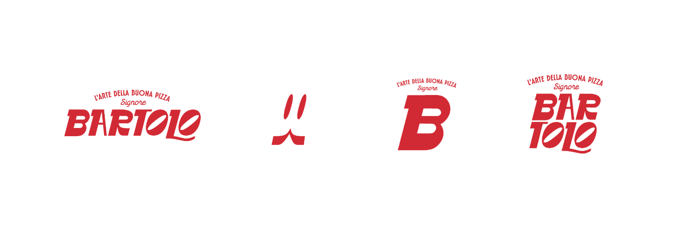
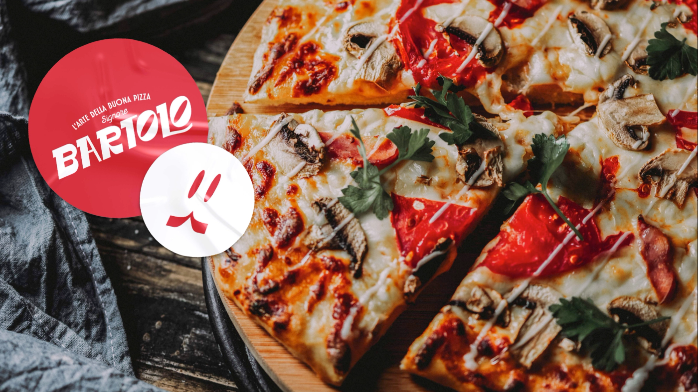
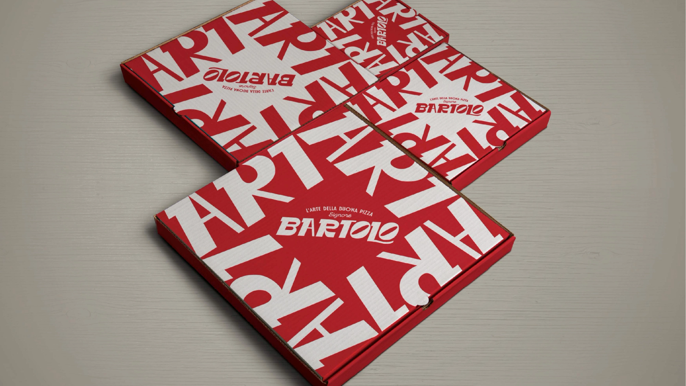
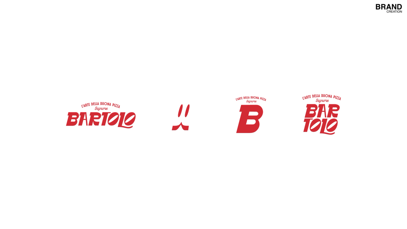
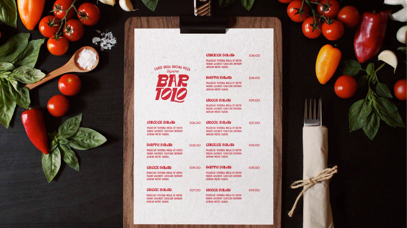
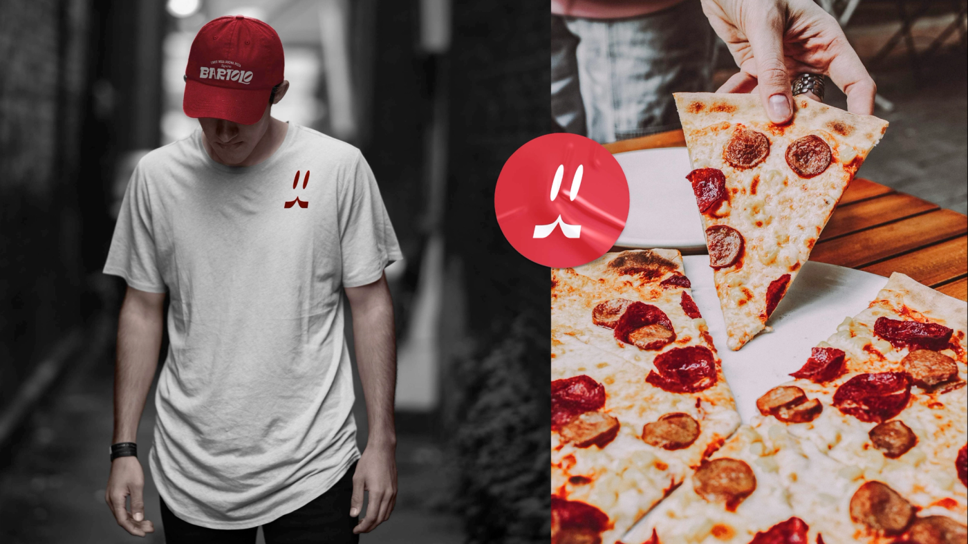
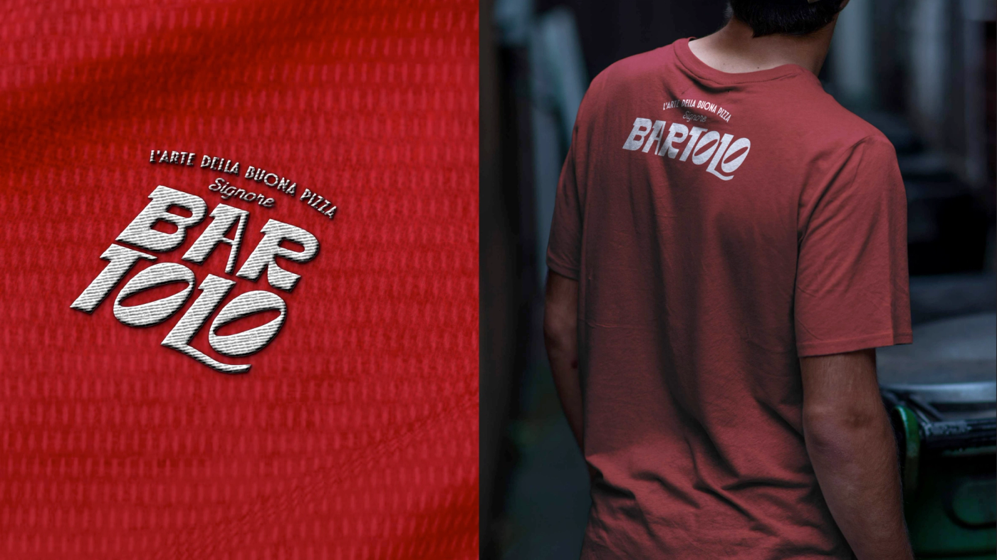
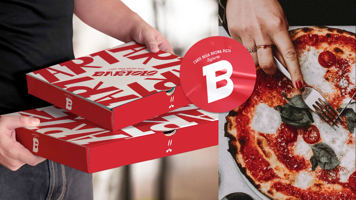
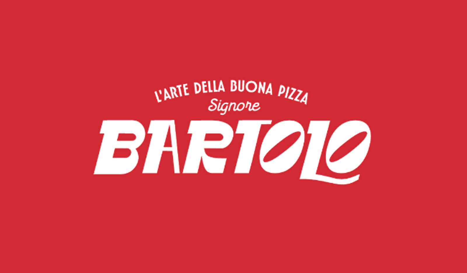
We created the full branding — identity, packaging, stationery, visual campaign and product mockups — starting from a mood board that blends 60s Italy, industrial textures, and a Ferrari red that became the brand’s signature color.
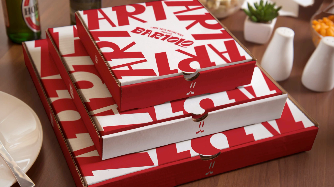
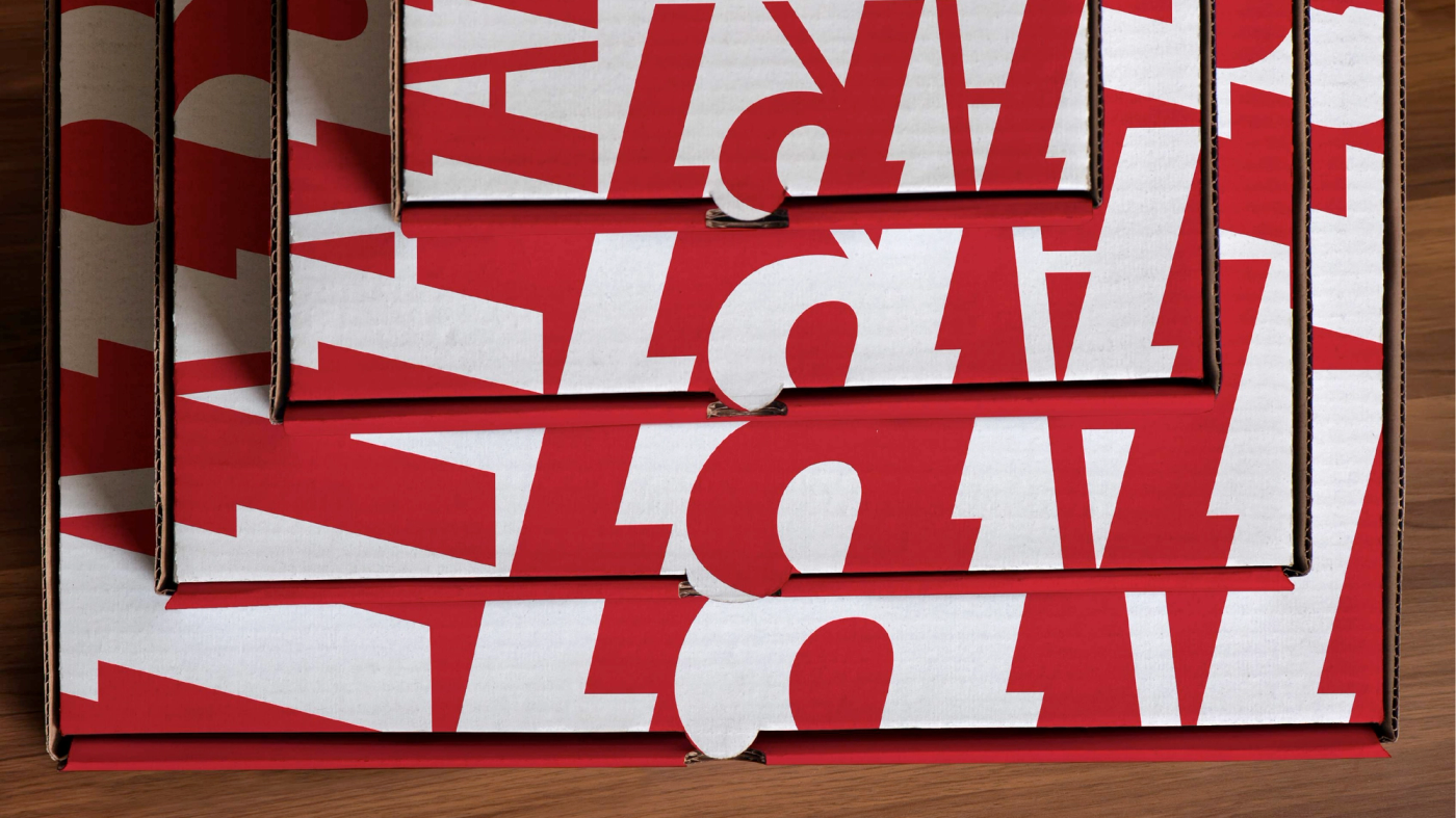
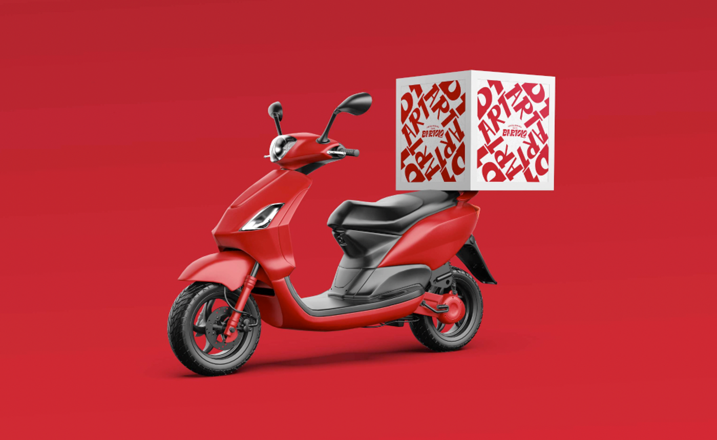
The challenge was to communicate “the art of good pizza” without falling into the postcard-trattoria cliché: that’s why the packaging uses bold, graphic typography (the repeated “ART” pattern on the boxes) instead of nostalgic illustrations — it speaks directly to a young, urban audience that experiences pizza as a social craving, not as a family heirloom.
Today Bartolo is a brand with a personality of its own: Italian tradition with street attitude.